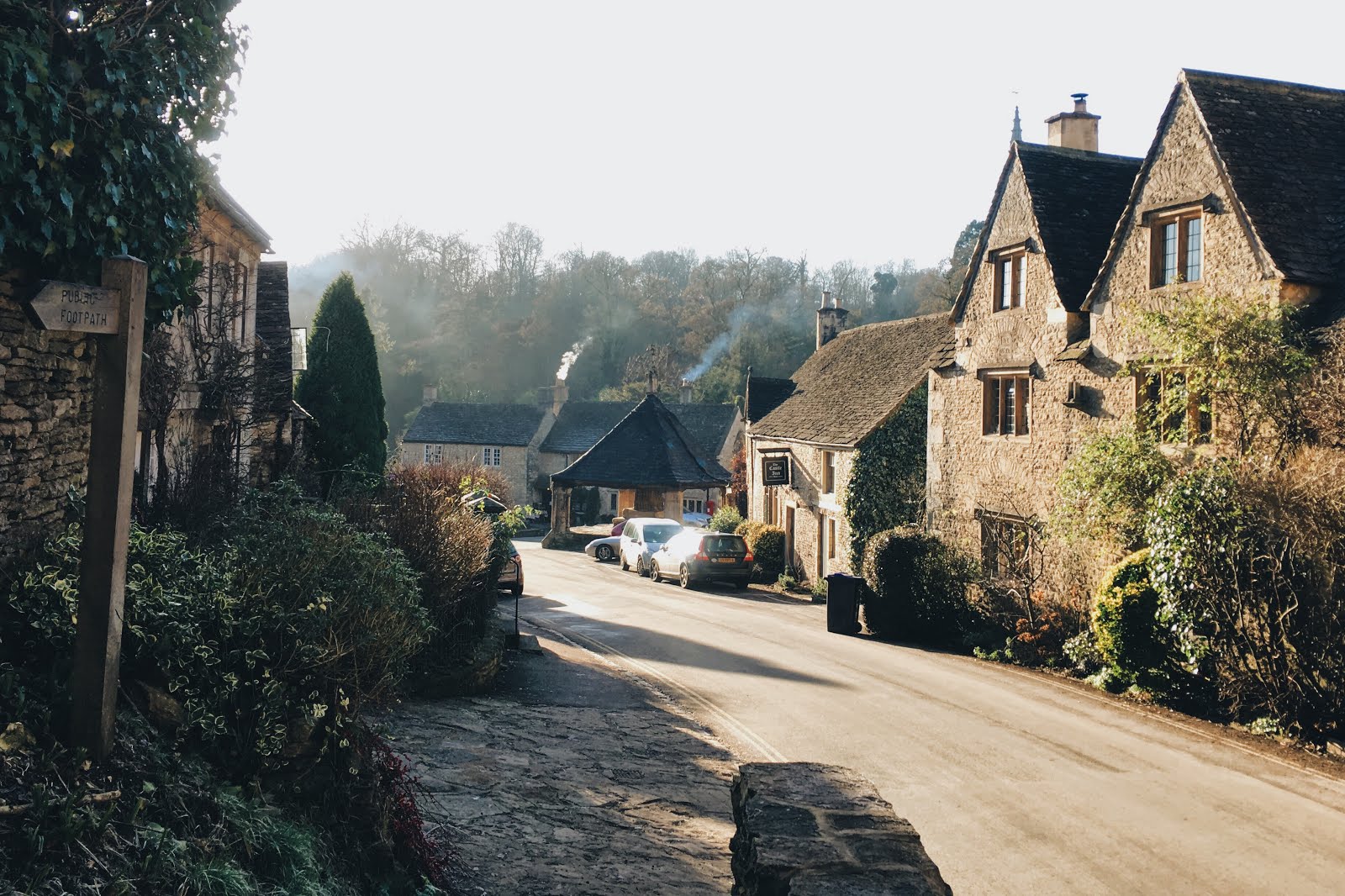
Cotswolds

Cotswolds
Cotswolds

Lake District

Lake District
Lake District

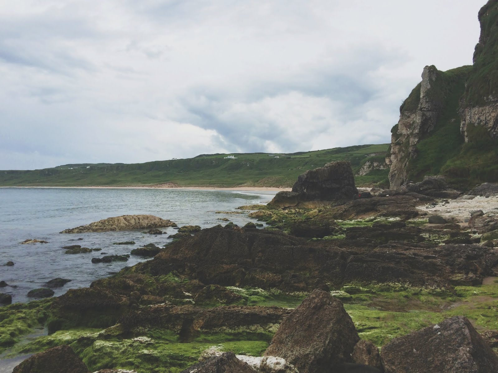
Ireland

Ireland
Ireland
Showing posts with label blogging tips. Show all posts

Tutorial | Designing a Blog Header with Picmonkey

Following one of my previous posts, 10 Easy Ways to Make the Most Out of a Default Blogger Template, I received a few requests asking if I would explain the process of how I make blog headers in a bit more detail. I do the vast majority of this kind of work on Photoshop now but before I had that I used to use a combination of Picmonkey and Pixlr, two online image editing tools, both of which essentially do the same job as Photoshop but without some of the more complicated features and extras. Picmonkey in particular is ridiculously easy to use and is extremely user-friendly so I thought I'd write up a tutorial on how you can use it to put your header together.

Before I begin I jut wanted to clarify that I'm not a graphic designer or illustrator by any means (any attempt I'd ever make at drawing up a header from scratch would just be awful), so this tutorial will just be a simple breakdown of the technical side of combining different elements together to create a brandable image; a much more accessible approach for those of us who aren't particularly artistically gifted.

A quick note on that though: it's really important that you respect copyrights on other people's work and make sure you read the licensing information on any image you wish use that you didn't create yourself. Not only could you find yourself in hot water by using images without the owner's permission, but it's also just not very nice. More on that later...

For now, here's how you (a mere mortal with limited artistic/creative ability) can put together a decent blog header...

1. Gather up your resources


Fonts

One good thing about Picmonkey is that you're able to access and use the fonts you've downloaded to your computer. However, sometimes it can take a while for them to transfer across and you may have to restart your browser or just wait for a bit after installing a new font.

There are a few different sites where you can download fonts for use on your design. The vast majority of these are free for personal use only. You may also find a few that free for commercial use too but they're quite often few and far between. Generally, to use a font on your blog (that isn't already free for commercial use) you'll have to purchase a commercial license. The cost of a commercial license for a font can vary drastically but you'll still find many around the US$5-10 bracket (around £3-6). 

Before I start a design project I normally go through and download any fonts I feel would be suitable for the 'look' I want to go for. I then try them out with my design to try and find the one that works the best. If I know the font is free for commercial use, great! If not, I go and find out how much a commercial license costs for that font. If it's affordable, I'll buy it, if not I'll normally just try something else. I don't know if this is necessarily the most efficient method but I feel like having a few different fonts to play around with initially helps me decide what sort of thing looks best for what I'm working on.

A few places where you can pick up fonts:

Font Squirrel: This isn't a hugely extensive database but all of the fonts listed here are free for commercial use. It's such a godsend of a resource!
How to check the licensing details: If you want a bit more information on the specifics of the font license, click on the font you want to use and then click on the 'license' tab on the page that appears.

1001 fonts: My personal favourite because it allows you to sample a snippet of text in each font.
How to check the licensing details: Hover over the price tag symbol to the right of the font and click for further information.

DaFont: Another good resource with some 28,000 fonts for your perusal.
How to check the licensing details: Click on the font you wish to use and their should be a 'note from the author' underneath the font sample on the page that appears.

Pickmonkey fonts: As far as I know, some of the fonts provided on Picmonkey are free for commercial use and others are not so make sure you check before you use any of them.


Graphics

You may want to just have a text header, in which case don't worry about this step! But sometimes it can be nice to incorporate some graphics into your header.

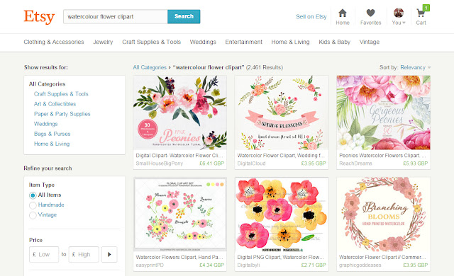
I buy all of the graphics I use for custom headers on Etsy. While there are still other places you can buy images, for example Creative Market, I have yet to find a cheaper resource for high quality graphics and illustrations. On Etsy there is an absolute multitude of artists selling their work as clipart along with a commercial license for just a few pounds.


One pitfall of buying graphic packs from Etsy stores is the fact that the graphic you buy isn't unique in the sense that it's being sold multiple times to multiple people who can then also use it for their own purposes. However, so long as that doesn't bother you, it's a very inexpensive way to brighten up your blog header compared to the alternative of commissioning an artist to create an image from scratch.

Again, make sure you check the Etsy store's policies and read their licensing rules before using their images! Even if you've paid for them, stores can sometimes have extended licenses you'll need to purchase to use the image in a commercial context.


2. Prepping your canvas


Sizing your canvas

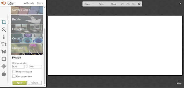
First things first, on the homepage of Picmonkey, click on 'Design' which will take you into the design area. I start all my headers on a canvas that's 900px (w) x 400px (h) and that seems to work well for Blogger. The width is the most important thing here, I always end up cropping my height down at the end anyway but having those extra few hundred pixels gives you a bit more room to work with.

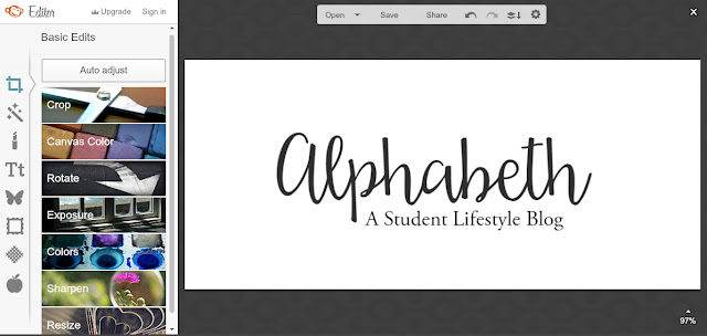
To resize your canvas, click on the square 'crop' symbol at the top of the bar on the far left which will take you to 'Basic Edits' and scroll down to 'Resize'. Make sure you un-tick 'Keep proportions' before you type in your dimensions, and then click 'Apply' to make your changes.


Creating a transparent background

I always make header backgrounds transparent. I just think it makes them so much easier to work with since you can then put them against any backdrop without a huge white bar getting in the way. Furthermore, if there ever comes a time when you want your header image to have a white background, you can just simply overlay the transparent image onto a white canvas and save it as another file and that's you sorted!

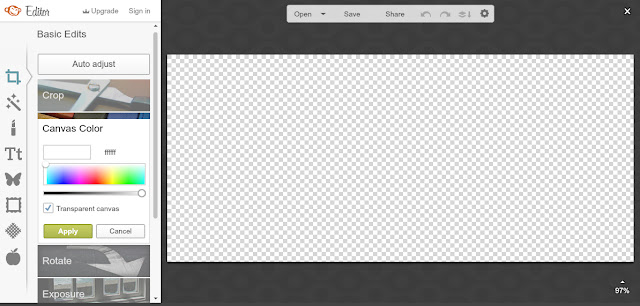
To make your canvas transparent on Picmonkey go to 'basic edits' - or the crop icon at the top of the menu- click on 'Canvas color' and tick 'Transparent canvas'.


3. Adding Text

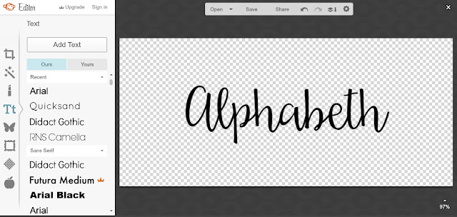
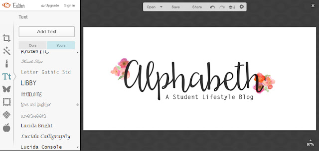
I've now chosen the font I want to use, I've downloaded it and installed it onto my computer. The next step is to add it to my design. On the left sidebar on Picmonkey again click on the 'Text' tool- that's the icon with the upper- and lower-case 'T's- and find the font you want. You can switch between Picmonkey's own ready-installed fonts and your own fonts by clicking on the 'Ours' and 'Yours' tabs at the top. When you've selected your font click 'Add Text' and type in your blog's title. 


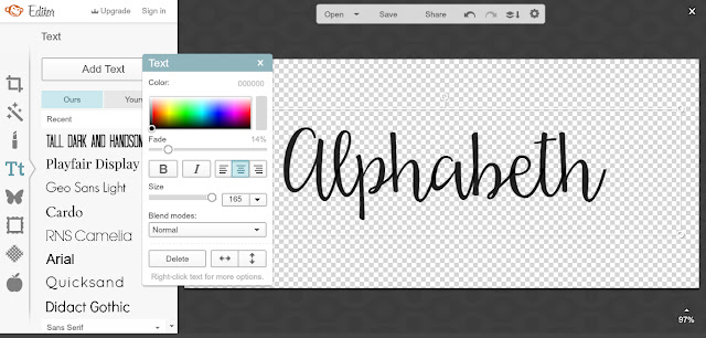
When you select your text a toolbar will appear that allows you to make adjustments. You can change your text's size either by pulling the 'size' bar across on the toolbar or by manually resizing the frame your text is contained in. You can also change your text's colour via the colour spectrum at the top. The arrows in the bottom right-hand corner will flip your text horizontally or vertically, the 'Blend modes' are premade format settings and the 'Fade' option edits your text's opacity. I usually fade my text out a little bit when I'm editing on Picmonkey to make it a little bit softer, especially if it's black. I also like the effect it creates but it's just a stylistic preference really.

4. Adding a Tagline

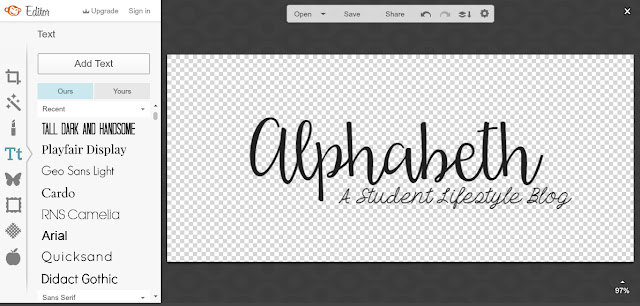
I've included the first image below to give an example what not to do! If you've used a cursive or decorative font for your blog title it's always best to use a much simpler serif font (like Times New Roman or Georgia) or sans serif font (like Arial or Tahoma) for your tagline, otherwise there's just a bit too much going on and the main focal point of your header is lost. The text in the example below also isn't aligned very well which is making the header look a bit unbalanced and lopsided.

As a general rule, it's a good idea to pair different font styles as a means of creating contrast (contrast is good!). So, if you're using a serif font for your header text, it might be nice to pair it with a sans serif font for your tagline or vice versa. I found an excellent pin with some rules for combining fonts here!


As you can see in the example below, I've changed the tagline to a serif font to contrast with my cursive header text. I also found that my tagline fitted nice and snug in between the dips in the 'p' and 'h', making the overall design look a bit tidier.

I've temporarily changed the canvas colour back to white so I can gauge the spacing a little bit better and get a better idea of what my header will look like against a white background, but I'll change this back at the end.


5. Adding Images

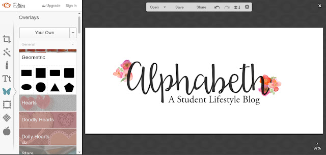
In the screenshot below I've bought some individual watercolour flowers from Etsy to place around my text. 

To add images to your header click on the butterfly icon in the sidebar which will take you to the 'Overlays' section. Here, Picmonkey has loads of its own graphics which you can definitely incorporate into your design if you'd like to. To add one of your own images though, click on 'Your Own' and select the image you want. Your overlays can then be edited and altered in the same way as your text.


The idea when adding graphics is to adorn your header without interfering with or obscuring the text in any way, since the most important thing is that your text is easily read! To prevent my flowers from getting in the way I've arranged the layers of my image so that the flowers have been sent to the back (apart from that one flower on the right-hand side which I've brought to the front to create a bit of depth). By adding the flowers at opposite ends of the header, again, it's helped to balance out the image.

To arrange your image's layers, right click on the layer you want to position or arrange and you'll have the option to 'Send to back' which will send the layer to the very back of the image, 'Send backward', which will send it a layer backwards, 'Bring forward' which will bring it a layer forwards and 'Bring to front' which will send the layer to the very front of the image. 

It's worth noting another option on this list 'Duplicate layer' which allows you to duplicate a layer onto your canvas without having to re-import it from your computer.


6. Final Tweaks

Design in general involves a lot of trial and error so don't be afraid to play around and try different things. For example, once I had my flowers added in, I didn't feel as though they worked amazingly well with my tagline font. The font was a little bit too formal and a little bit too heavy with all of the elements involved in my header so I decided to change it to something a bit lighter, as you can see in the image below.


At this stage, another good way to create contrast between your header and tagline is to play around with colour. In the example below I've changed my tagline text to a colour that complements the images I've used, and I actually really like the end result!

Also, as I said previously, I only changed my canvas colour back to white temporarily. If you do this make sure you change it back to transparent before you save it!


Before I save my image I also want to crop off the excess height, since this will just appear as unnecessary padding on my blog, though I still want to keep the width the same. To crop your image, go back to 'Basic Edits' and click on 'Crop', then selected the area you wish to crop down to and click 'Apply'.


7. Save your image

Finally, when you're happy with the header you've created, hit 'Save' at the top of your page. When you're saving your image, make sure you save it in a PNG format by selecting this option in the drop-down menu. This will preserve your header's transparency. 

And you're done! If you need it, you can find some more information about installing a header onto a Blogger blog here.


I know not everyone will benefit from this tutorial but I hope at least a few people find it helpful. As you can see I actually ended up liking this header so much I've permanently adopted it, which was a bit unexpected! I hope you like the end product, I feel like it's a nice change.

If you have any more questions please feel free to leave them in the comments, or tweet me @alphabethblog!

0

Blog Design | 10 Easy Ways to Make the Most of a Default Blogger Template


When I first started blogging I knew literally nothing about coding or blog design or any of that. And, when first confronted with one of Blogger's default templates, I had no idea how to manipulate it or transform it into something I felt represented me or what I wanted my blog to be, beyond changing the text font and colour, which really did little to improve the situation. Even once I'd managed to carve out a very basic design, I couldn't figure out how to iron out Blogger's little quirks, like the shadow around my images or the way my post title and date would always be aligned left no matter what I did.

In an attempt to quash my frustration with my blog design, I bought a custom template from a designer which I had for about a year and I suppose just through altering it and changing bits and pieces here and there I finally started to understand a bit more about how Blogger worked. However, it did take me a little while before I felt justified actually spending money on making my blog look a bit nicer, especially because at that stage I didn't know whether I'd actually be in it for the long haul (turns out I was!). If you're like I was and are a bit unsure about whether you want to invest in a designer template, or if you'd rather just design your blog for yourself, I've put together a list of 10 very simple things you can do to improve the look of a Blogger default template, all of which are sort of outside the realm of Blogger's customisation tool which will only get you so far.


A quick explanation of HTML and CSS:


HTML and CSS are both coding languages that make up and support different elements of a website or page. 

HTML makes up the main building blocks of the site and provides the website with instructions on how it should look. Your blog's HTML can be found in Template > Edit HTML on your Blogger dashboard.

CSS deals with the stylistic elements of the site, dictating the site's design and aesthetics. Things like fonts, margins, colours, heights and widths can be easily edited using CSS. You can edit your blog's CSS in Template > Customise > Advanced > Add CSS.


On a website, the CSS code is linked to parts of the HTML and the two work hand in hand to create what you see on the page. 


1. Create a header image

Your header is the first thing your readers will see when they visit your site and so I can't stress the importance of a clear, attractive header that represents the theme of your blog and content well! 

Creating a header image as opposed to just using the default text header on Blogger can give you a lot more room to be creative and have control over the font, colour, size etc. You don't have to have Photoshop or be a total design whiz to come out with a great header. Pixlr.com/editor is an excellent Photoshop alternative and Picmonkey.com is another great easy-to-use site.


The recommended size of a Blogger header is (w) 900px x (h) 400px, though I normally end up cropping the height down to about 250px when I design custom headers. I'd recommend you work with a transparent background and save it in a .png format which is designed to support images that are to be displayed on the internet and allows you to save an image on a transparent background.

To upload your header image go to your Blogger dashboard and then click on 'Layout' in the sidebar and then the under bar saying 'Header' click 'edit' in the bottom right-hand corner. In the new window that appears check the box next to 'Instead of Title and Description' under the 'Placement' section and also make sure that the box beside 'Shrink to fit' is not checked. Upload your header image, hit 'save' and that will be your header in place. 


2. Centre your blog header 

If you've uploaded a header image that is 900px in width, it's likely that the content of your header will be a little more centred than it was before but you'll still want to reinforce its position in your blog's code. Note that this method will centre both text and image headers and will keep either in place if you decide to switch between them.

Click on 'Template' in the sidebar of your Blogger dashboard, and then click on 'Customise' and 'Advanced'. In the advanced section of the Blogger customisation tool you need to scroll down to the bottom of the list and click on 'Add CSS', copy and paste the following and then hit 'enter' to make it appear in the preview:

#header-inner img {
margin: 0 auto !important;
}

#header-inner {
text-align:center !important;
}

If you're happy click on 'Apply to Blog' to save your changes.


3. Centre your post title and date

It's entirely up to whether you'd like your post title and date centred, it's a design preference really, though if you've ever wondered how you get them to sit in the centre, this is how you do it! Similar to how you centre your blog header, in Template > Customise > Advanced > Add CSS, underneath where you've pasted the code to centre your header add:


.post-title { text-align: center; }
.date-header { text-align: center}

Similarly, if you want to align them to the left of your post, simply replace 'center' with 'left' in the code above.

If you're using Blogger's white 'Simple' template you can also remove the grey background behind the date header by going to Customise > Advanced > Date header and changing the background to transparent and the text to a colour of your choice.


4. Centre your sidebar headers

Again in the 'Add CSS' section, copy and paste the following under the code you have so far:

.sidebar h2 {
text-align: center;
}

You can customise the font, size and colour of your sidebar headers in Customise > Advanced > Gadgets.


5. Centre your tabs and remove the border around them


Centre your tabs


In 'Add CSS' enter:

.PageList {
text-align:center !important;
}

.PageList li {

display:inline !important; float:none !important;
}

Hit 'enter' to see your changes in the preview.


Remove the borders


Again, add the following into your CSS:

.tabs-inner .widget li a, .tabs-inner .widget ul, .tabs-inner .section:first-child ul {border:none;}

If you want to make your tab backgrounds transparent the easiest way is to go to Customise > Advanced > Tabs Background and change both to transparent.


6. Remove the border and shadow around your images.

You'll have noticed that all default Blogger templates automatically place a border and shadow around your images. This used to annoy me so much, especially when I was trying to create a profile in my sidebar and Blogger kept putting a square border around my circular image! Thankfully it's an easy fix, you just go to Template > Customise > Advanced > Add CSS and insert the following under your existing code:

.post-body img, .post-body .tr-caption-container, .Profile img, .Image img, .BlogList .item-thumbnail img {
padding: 0px !important;
border: 0px !important;
background: none !important;
-goog-ms-box-shadow: 0px 0px 0px transparent !important;
-moz-box-shadow: 0px 0px 0px transparent !important;
-webkit-box-shadow: 0px 0px 0px transparent !important;
box-shadow: 0px 0px 0px transparent !important; }


7. Remove the Blogger navbar

All Blogger templates include a Blogger navigation bar by default which appears at the top of your blog and contains various tools such as a shortcut to create a new post and access to Blogger's design area. It also allows readers to surf through other Blogger sites. A useful feature, though unfortunately it appears to everyone who visits your blog and in a way takes away from the sense of your blog as its own entity separate from Blogger. It's also a little unsightly.


To remove it go to your Blogger dashboard and click on 'Layout' in the sidebar. You'll see the the navbar along the top of your layout. Click 'edit' in the bottom right-hand corner, scroll to the bottom of the list of options and set it to 'off'.


8. Add your own favicon

Your favicon is the tiny image that appears in your blog's tab on an internet browser. Blogger templates come with the standard Blogger favicon that you can then change to an image that you feel represents your blog well- maybe your header, button or a part of your header- though it needs to be able to work as a square thumbnail. 


If you're creating your favicon from scratch, try to design it as a relatively small image, say 50px x 50px, so that eventually making it smaller won't have too much of an adverse effect on the image quality. When you have your final design, on your Blogger dashboard go to 'Layout' and the option to edit your favicon will be in the top right-hand corner. Upload your image and save it.


9. Adjust your widths

For some reason, Blogger templates aren't very wide to begin with. Increasing the width of your blog and making the most of the space you have on your page not only gives you room to fit in more content, for example, by allowing you to upload larger images without them beginning to overlap into your sidebar, but it also is a lot more pleasing to the eyes of your readers.

To adjust the width of your blog go to Template > Customise > Adjust widths, and play around with the widths of both your main content and your sidebar.


10. Change your link colours

This is something very basic and again is up to your own personal preference but I do think changing the colour of the links from the standard "Blogger Blue" that comes with the white Simple template can really help to transform the look of your blog. 

To change your link colours go to Template > Customise > Advanced > Links. I'd personally recommend you make the 'link colour' and 'visited colour' the same and use another complementary colour for your 'hover colour'.


I just want to reiterate the fact that these are all just suggestions of ways you can customise your blog and make it more your own. Please don't feel like you have to apply any of these if you don't want to! Though I do hope someone finds them helpful.


Hope you're having a brilliant weekend!

1

Twitter and Blogging | The Low-Down on Blogger Chats


I never used to be much of a Twitter user. In fact, I've had a bit of a love/hate relationship with it it over the years (leaning a little bit more towards the 'hate' side, that being said). I feel like this was mostly down to me growing tired, not only of my classmates' endless Twitter commentaries in my final year of school, but also as the chronic over-sharer that I am, the potential for my feed to also be subject to their scrutiny. To be honest, I'm just not a big social media fan in general- ironic I know, being a blogger and everything!- and, as a result, for the first several months of my blog's existence, since I hadn't had Twitter for a long time before then, I really didn't feel the need to get it again. However, in September last year, in some moment of reckless abandon, I decided to bite the bullet and create a Twitter for my blog. I think at the time I was just curious to see what I was missing, and honestly for the extent to which Twitter has enriched my blogging experience, I'm so glad I finally did it! 

I think it was from then, through Twitter, that blogging and the blogosphere really started to become a community to me. I mean, it always had been before, but now it just felt all the more tangible. Suddenly I was able to really connect with all the amazing bloggers whose content I had enjoyed reading for so long. I could have discussions with them, hear their thoughts and share mine, and consequently, over the last few months I've really warmed to Twitter as well as having begun to really appreciate it's role in forming relationships in the blogging world.

One of the best discoveries of my time on Twitter has definitely been the huge number of blogger chats taking place throughout the week, which is something I literally had no idea existed before! I'm therefore kind of writing this post for the benefit of any Twitter n00bs, like me, out there who have maybe seen something about these chats or have wanted to join in but aren't too sure what the whole thing's about. Just because I wish I'd had some comprehensible breakdown of what the heck was going on!


So, what are blogger chats?

Basically blogger chats are way to engage with other bloggers, generally about topics related to blogging or whatever type of blogging you do, via Twitter. A number of these chats take place at certain times on certain days during the week and are led by "host" accounts that ask questions to encourage discussion, which you can then answer or contribute to using the chat's designated hashtag. Some chats have a specific topic for each chat, some are just general and some are then a mixture of the two.

How can I take part?

I've tried to make up a somewhat comprehensive list below of all the different chats you can participate in and their times! Please note that all the times listed below are GMT unless stated otherwise.

Monday

#bdib: 7-8pm; hosted by @blogsdoitbetter (@touchofbelle)
One of the more general chats. Topics tend to include everything from promoting your blog to finding inspiration for content.
#fbloggers: 8-9pm; hosted by @BeckyBedbug
A chat for all things related to fashion blogging.
#blogtrends: 9-10pm EST (Tues 2-3am GMT); hosted by @BlogTrends
A chat designed to offer advice and support on how to grow and develop your blog

Tuesday

#bookbloggers: 7-8pm; hosted by @bookblogchat
For all you bookworms out there! A chat that revolves around authors, books and book blogging.
#mybchat: 7-8pm; hosted by @MarketYrBlogCht
A chat aimed specifically at discussing ways to market your blog.
#fblchat: 8-9pm; hosted by @fashbeautylife
Another more general chat for fashion, beauty and lifestyle bloggers alike.
#bloghour: 9-10pm; hosted by @UKblogawards
Normally quite a general chat to give you the opportunity to network with other bloggers.

Wednesday
#lbloggers: 7-8pm; hosted by @lbloggerschat
A chat for lifestyle bloggers on a whole host of blogging-related topics. There's normally a guest host each week which is announded on the @lbloggerschat twitter page.
#bbloggers: 8-9pm; hosted by @bbloggerschat
A general chat for beauty bloggers.

Thursday

#crazybloggers: 7-8pm; hosted by @HollyCassell
A newish general blog chat hosted by the lovely Holly.
#fbloggers: 8-9pm; hosted by @BeckyBedbug
The second fashion blogging chat of the week- not to be confused with #fdbloggers (food bloggers!)
#fdbloggers: 8-9pm; hosted by @fdbloggers
A chat for any bloggers with an interest in food
#tbloggers: 9-10pm; hosted by @teenbloggerchat
A general chat session for all teenage bloggers.

Friday

#bdib: 8-9pm; hosted by @blogsdoitbetter (@touchofbelle)
The second #bdib chat of the week.

Saturday

#socialbloggers: 6-7pm; hosted by @Noor_Unnahar and @Skinnedcartree
A fab general blog chat for all bloggers.
#tbloggers: 8-9pm; hosted by @teenbloggerchat
A topic-specific blog chat for teen bloggers.

Sunday

#lbloggers 7-8pm; hosted by @lbloggerschat
The second #lbloggers chat of the week for lifestyle bloggers.
#bbloggers: 8-9pm; hosted by @bbloggerschat
The second beauty blogger chat of the week.


I'm sure there are a few more niche chats that I've missed here so let me know if there's any I could add! I hope there's at least a few people out there who might find this post helpful! :)

Do you take part in blogger Twitter chats? What do you think of them?
42
Powered by Blogger.